Choosing pashmina or cashmere is not only about softness and quality, color plays a major role in how luxurious, versatile, and timeless a piece feels.
By understanding color theory, you can select pashmina and cashmere shades that match your skin tone, wardrobe, season, and occasion, without confusion.
This guide explains everything in a simple, practical way, so you can make the right choice every time.
What Is Color Theory and Why It Matters for Pashmina & Cashmere
Color theory is the study of how colors are formed, how they relate to one another, and how they influence visual perception and human response. It provides a structured way to understand color balance, contrast, and harmony.
In the context of luxury textiles such as pashmina and cashmere, it helps explain how certain shades appear softer, richer, or more balanced when worn. It also guides how colors interact with fabric texture, light, and surrounding garments, influencing overall appearance and wearability.
Since pashmina and cashmere are often chosen as statement pieces, thoughtful color selection plays an important role in enhancing elegance, ensuring versatility, and creating a refined visual impression.
Carefully selected colors that feel elegant, balanced, and easy to wear every day. Shop Raagari →
How Pashmina & Cashmere Colors Are Created
Understanding color starts at the source.
Cashmere and pashmina fibres naturally come in shades like:
- White
- Beige
- Light brown
- Grey
These natural tones are often preserved for minimalist designs. Other colors are created through careful dyeing, especially in handcrafted pashmina, where colors appear softer and more refined.
This is why high-quality pashmina colors never look harsh or overly bright.
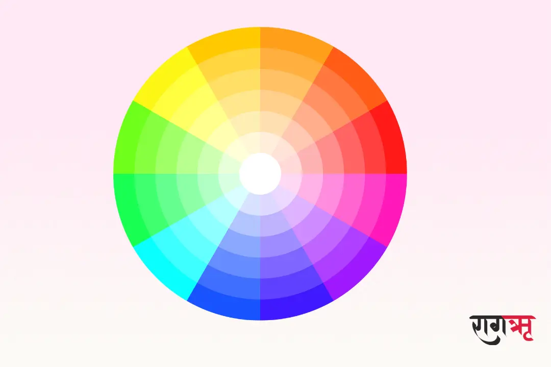
Understanding the Color Wheel for Luxury Shawls
The color wheel helps explain how colors relate to one another.
Primary colors
Primary colors are red, blue, and yellow, and they form the foundation of all other colors. These colors cannot be created by mixing any other shades.
Secondary colors
Secondary colors are created by mixing two primary colors together, such as blue and yellow to make green. They add variety and balance to color palettes.
Tertiary colors
Tertiary colors are formed by mixing a primary color with a neighbouring secondary color. These colors create softer, more nuanced shades often used in refined and luxury designs.
Warm vs Cool Colors in Pashmina & Cashmere
This is one of the most important color theory concepts.
Warm Colors
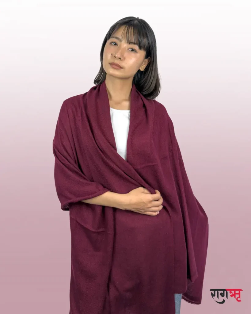
Examples: camel, maroon, rust, mustard
- Feel cozy and rich
- Perfect for winter and festive wear
- Common in traditional pashmina designs
Cool Colors
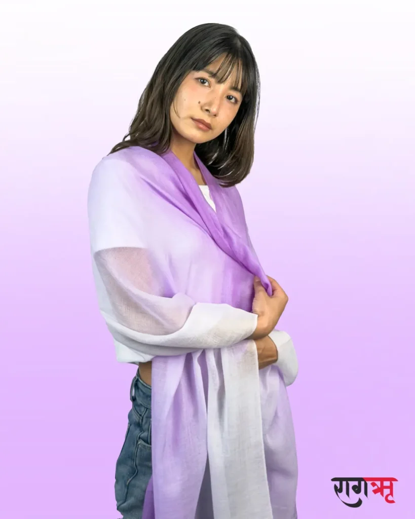
Examples: navy blue, emerald green, charcoal grey
- Feel calm and modern
- Ideal for formal and everyday styling
- Popular in contemporary cashmere collections
Choosing between warm and cool colors instantly improves how a shawl looks on you.
Color Psychology: What Pashmina & Cashmere Colors Communicate
Colors influence emotions more than we realize.
- White & Ivory – purity, elegance, simplicity
- Beige & Camel – warmth, sophistication, versatility
- Red & Maroon – confidence, tradition, celebration
- Blue – calm, trust, refinement
- Green – balance, nature, harmony
- Black & Grey – modern luxury, authority
This is why neutral and earthy tones remain popular in luxury fashion year after year.
How to Choose the Right Color for Your Skin Tone
Color theory helps match pashmina and cashmere products with natural skin undertones, ensuring the color looks balanced and flattering whether it is worn as a shawl, scarf, stole, or garment.
Warm Skin Tones
A warm skin tone means your skin has golden, yellow, or peach undertones that naturally pair well with earthy and rich colors. People with warm skin tones usually suit shades that carry warmth and softness.
Colors like cream, camel, olive green, and warm reds blend naturally with the skin and enhance the richness of pashmina and cashmere textures.
Cool Skin Tones
A cool skin tone has pink, red, or bluish undertones that pair well with colors carrying cool depth and clarity.
Shades like grey, navy blue, emerald green, and lavender complement cool skin tones, creating a refined and harmonious look across pashmina and cashmere products.
Neutral Skin Tones
Neutral skin tones offer the most flexibility. Both warm and cool shades tend to work well, allowing greater freedom when choosing colors across different pashmina and cashmere styles.
This simple approach helps prevent color mismatch and allows pashmina and cashmere products to look naturally elegant and well-balanced, regardless of how they are styled or worn.
Discover Your Colors Through Vedic Astrology
Explore personalised color guidance aligned with your nature and life energy.
Seasonal Color Guide for Pashmina & Cashmere
Winter
Deep colors like maroon, navy, charcoal, and forest green add warmth and richness, making them ideal for pashmina and cashmere products in colder weather.
Spring & Summer
Light shades such as pastel pink, soft blue, mint, and ivory feel fresh and breathable, suiting lightweight pashmina and cashmere products.
Autumn
Earthy tones like rust, olive, brown, and mustard reflect seasonal warmth and balance across pashmina and cashmere products.
Common Color Mistakes to Avoid
- Choosing overly bright or synthetic shades
- Ignoring contrast with outfits
- Following trends instead of timeless colors
- Overlooking cultural meaning of colors
Classic tones always have higher long-term value.
Why Color Theory Enhances the Luxury of Pashmina & Cashmere
Color theory transforms pashmina and cashmere into more than just fabric.
It turns them into expressions of identity, craftsmanship, and elegance.
For brands like Raagari, color is not decoration, it is an essential part of storytelling and design philosophy.
Final Thoughts: Choose Color with Confidence
When you understand color theory, choosing pashmina and cashmere becomes easy and enjoyable.
By focusing on:
- Balanced tones
- Skin-tone harmony
- Seasonal relevance
- Timeless elegance
you invest in pieces that remain beautiful for years.
Invest in pashmina and cashmere where color, craftsmanship, and elegance come together. Shop the Raagari Collection →
Explore Raagari Everywhere — Shop, Follow & Stay Connected
FAQs
How do I choose the right pashmina or cashmere color for my skin tone?
Warm skin tones suit shades like camel, cream, and warm red, while cool tones work best with grey, navy, and emerald; neutral tones can wear both. Choosing colors that harmonize with your undertone ensures elegance and balance.
What colors of pashmina and cashmere are best for each season?
Deep shades like maroon, navy, and charcoal are ideal for winter, pastel and light shades for spring and summer, and earthy tones like rust and olive suit autumn. Seasonal colors enhance visual appeal and wardrobe versatility.
Why is color theory important for pashmina and cashmere products?
Color theory helps select shades that are harmonious, flattering, and versatile across outfits and occasions. It ensures luxury fabrics like pashmina and cashmere maintain elegance and timeless appeal.